Zomato
Redesigning the Zomato Consumer App - Version 17
Consumer App · iOS & Android · Visual Design & UX Improvement · Design System
INTRODUCTION
Being part of something that millions use every day
I was a UI/UX designer at Zomato, and I got to be a big part of an important project — making the Zomato app better. I redesigned important features like Order Tracking, Menu, Cart, Search, and Profile.
At Zomato, there is a habit of working on the consumer app every year to make it simpler and more user-friendly. V17 was the most substantial of these updates during my two years there.
In two years at Zomato, I was involved in more than 30 small and large projects. V17 was the most substantial among them.
PROBLEMS
What was broken - documented before a single screen was designed
Before jumping into solutions, I conducted a thorough app audit of V16 - capturing real-time screenshots of the entire user journey and documenting every screen that needed improvement.
What the audit found:
Inconsistent back arrow styles throughout the app
Font sizes too small - significant white space going to waste
Inconsistent strokes - some elements with borders, some without
Too much information on screen simultaneously - high cognitive load
Margin and spacing issues across multiple flows
Readability issues due to thin, small fonts
Too much scroll required to find relevant content
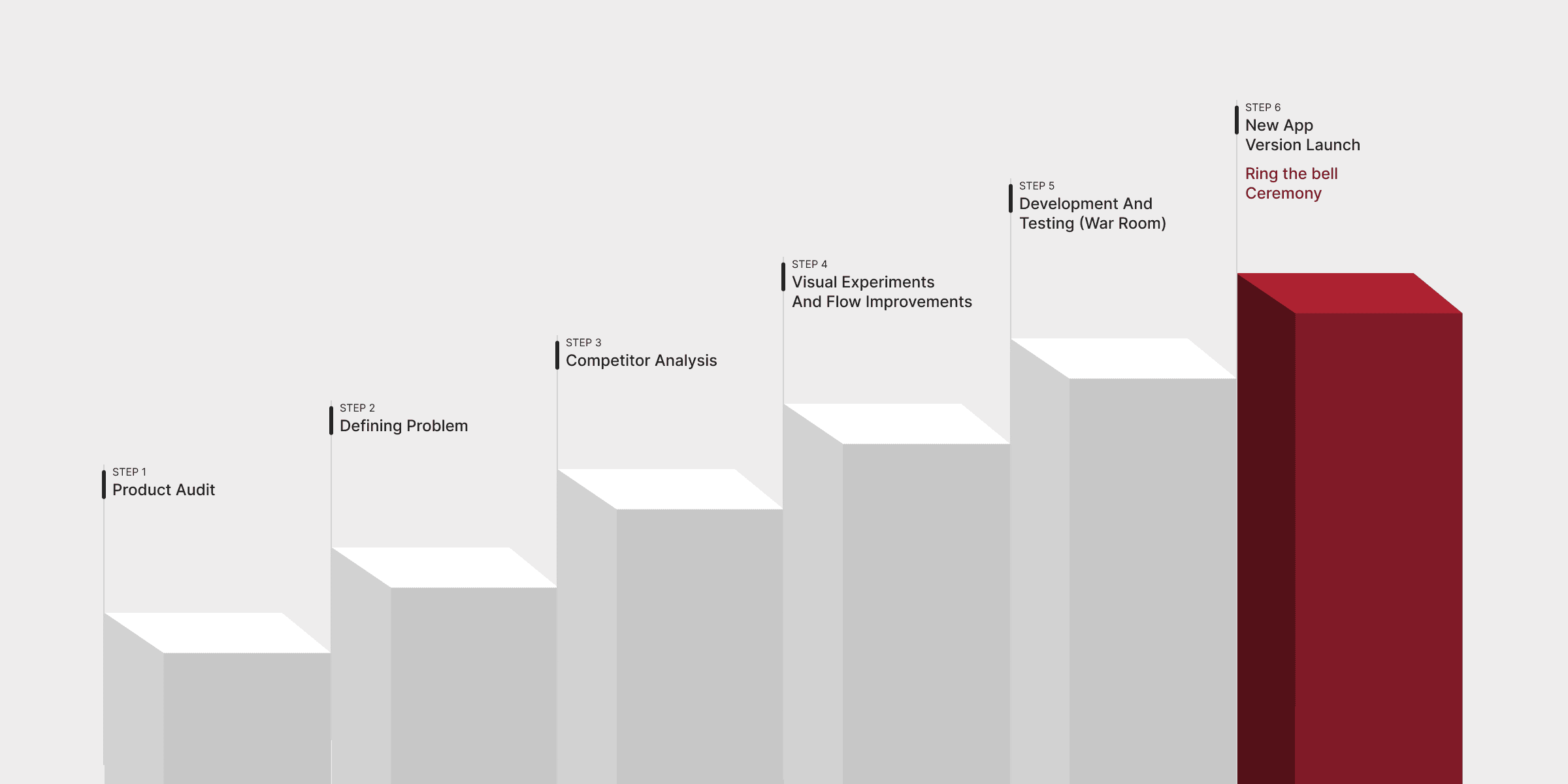
MY PROCESS
Six steps from audit to launch
STRATEGY
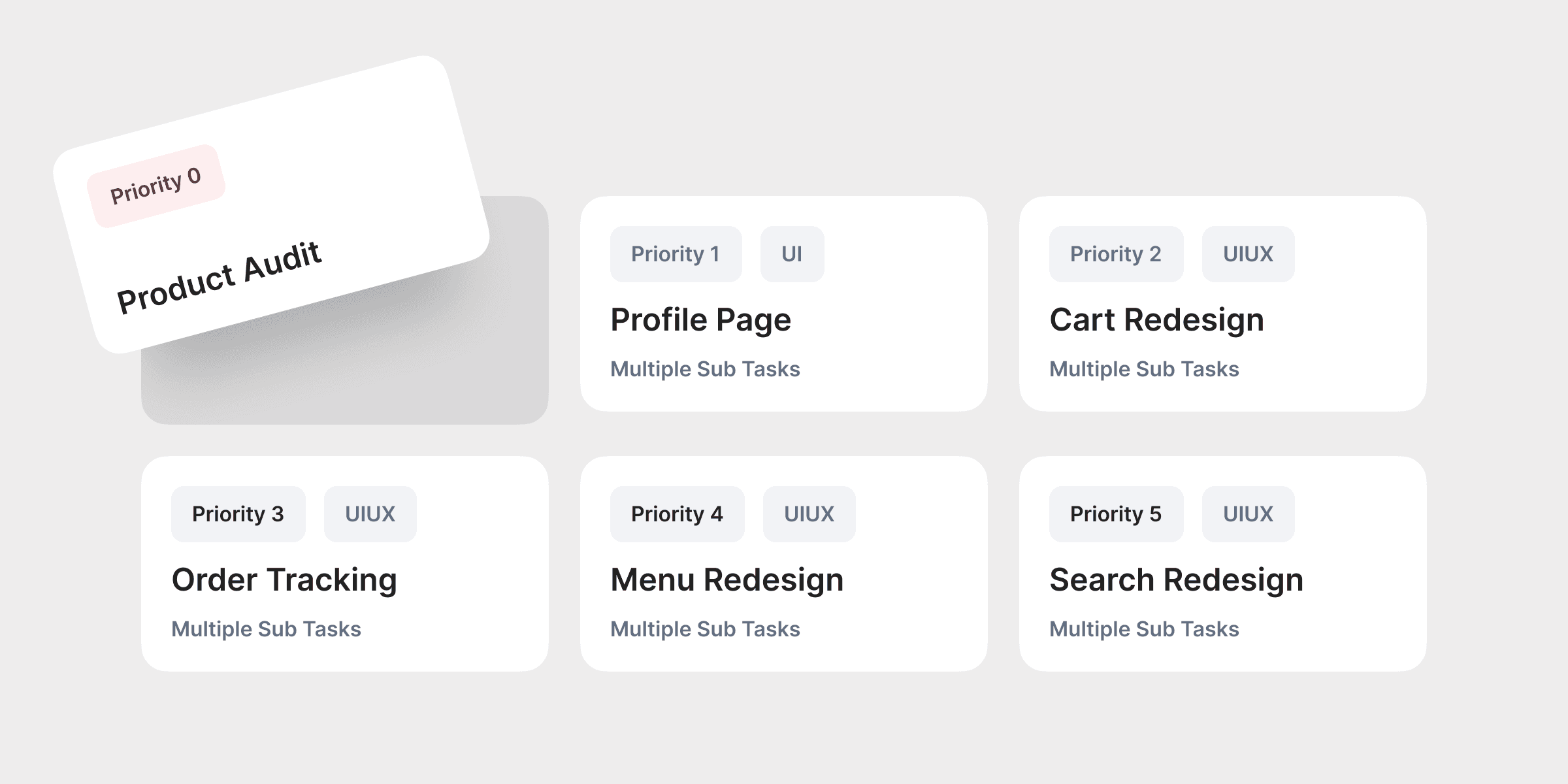
Setting up the plan - Priority 0 through 5
The approach was to start with screens requiring minimal effort and progressively work up to complex ones.
Priority order:
Priority 0 — New Font (system-level, affects everything)
Priority 1 — Profile Page (UI only, lower complexity)
Priority 2 — Cart Redesign (multiple tasks, UI/UX)
Priority 3 — Order Tracking (multiple tasks, UI/UX)
Priority 4 — Menu Redesign (multiple tasks, UI/UX)
Priority 5 — Search Redesign (multiple tasks, UI/UX)
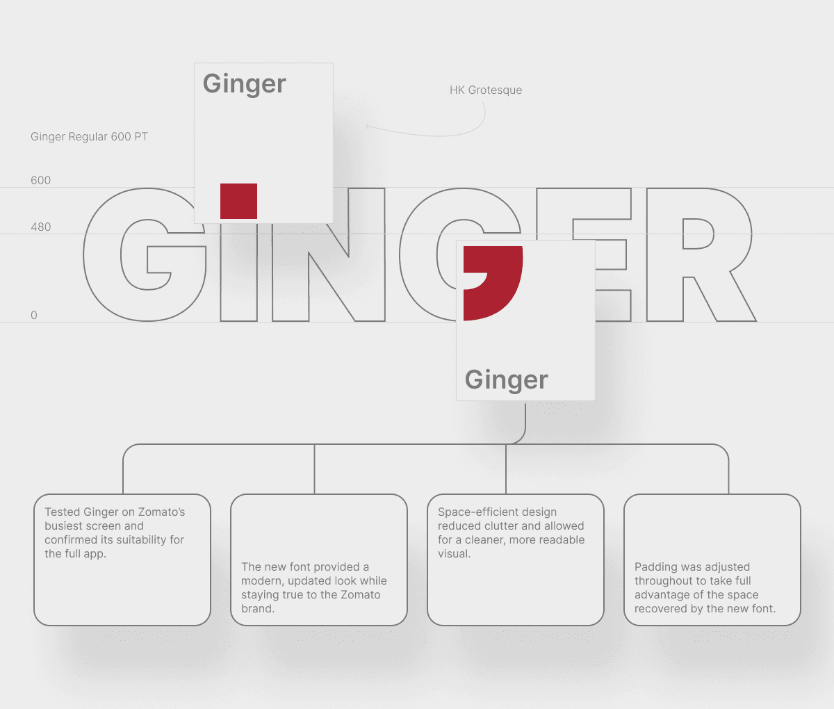
Before any screen work could begin, we hit a critical system-level issue — the font.
Zomato's existing font Okra was taking up too much space while compromising readability. After exploring alternatives, we found Ginger - a sleeker font based on HK Grotesk. It became Priority 0 because every other design decision flowed from it.
PRIORITY 0 — FONT
Okra → Ginger: Starting with the system
War-room collaboration model
The font switch was validated first on Zomato's busiest and most visually complex screen — the Menu page. If Ginger could work there, it could work everywhere.
PRIORITY 1 — PROFILE PAGE
Less clutter, clearer structure
The Profile page was chosen as the first full redesign — UI only, no complex UX flows. The right place to establish visual patterns before tackling heavier screens.
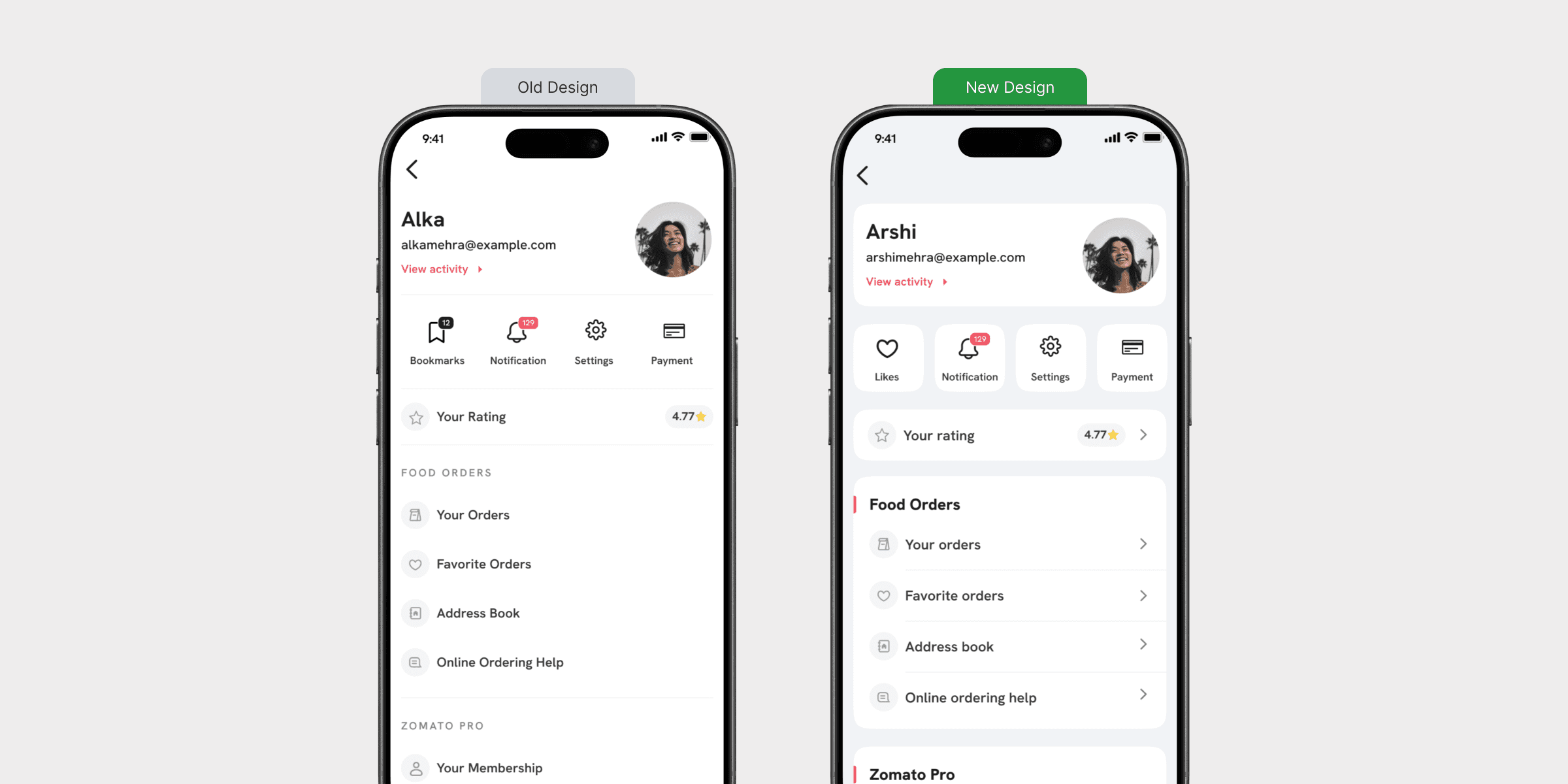
Introduced a refined soft-tone background system with a subtle blue tint to improve readability, reduce visual fatigue, and create a more premium interface feel.
Redesigned the card architecture with improved spacing, hierarchy, and component segregation to enhance content clarity and scanning efficiency.
Leveraged the font’s space-efficient structure to minimize clutter, increase information density, and deliver a cleaner, more balanced visual experience.
PRIORITY 2 - CART REDESIGN
Simplifying the path to checkout
The Cart had accumulated complexity over time - multiple competing sections, visual noise from promotional elements, and unclear hierarchy between order items and action steps
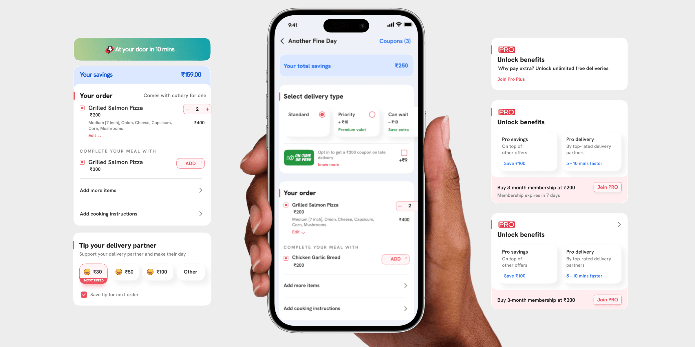
Delivery address section simplified — clean delivery time line replaces verbose address
'On-Time or Free' promotional banner removed — reduced visual clutter
Your Order section given a red left-border divider — clear section hierarchy
Item quantity controls redesigned — cleaner stepper with better tap targets
'Complete Your Meal With' upsell integrated cleanly — contextually relevant
Continue CTA made full-width and prominent — clear primary action
PRIORITY 3 - ORDER TRACKING
The screen users stare at most
Tracking is a big deal at Zomato. I had already resolved most UX issues before V17 began. During V17, the focus was on applying the new visual system to a screen that millions of users watch closely every time they order.
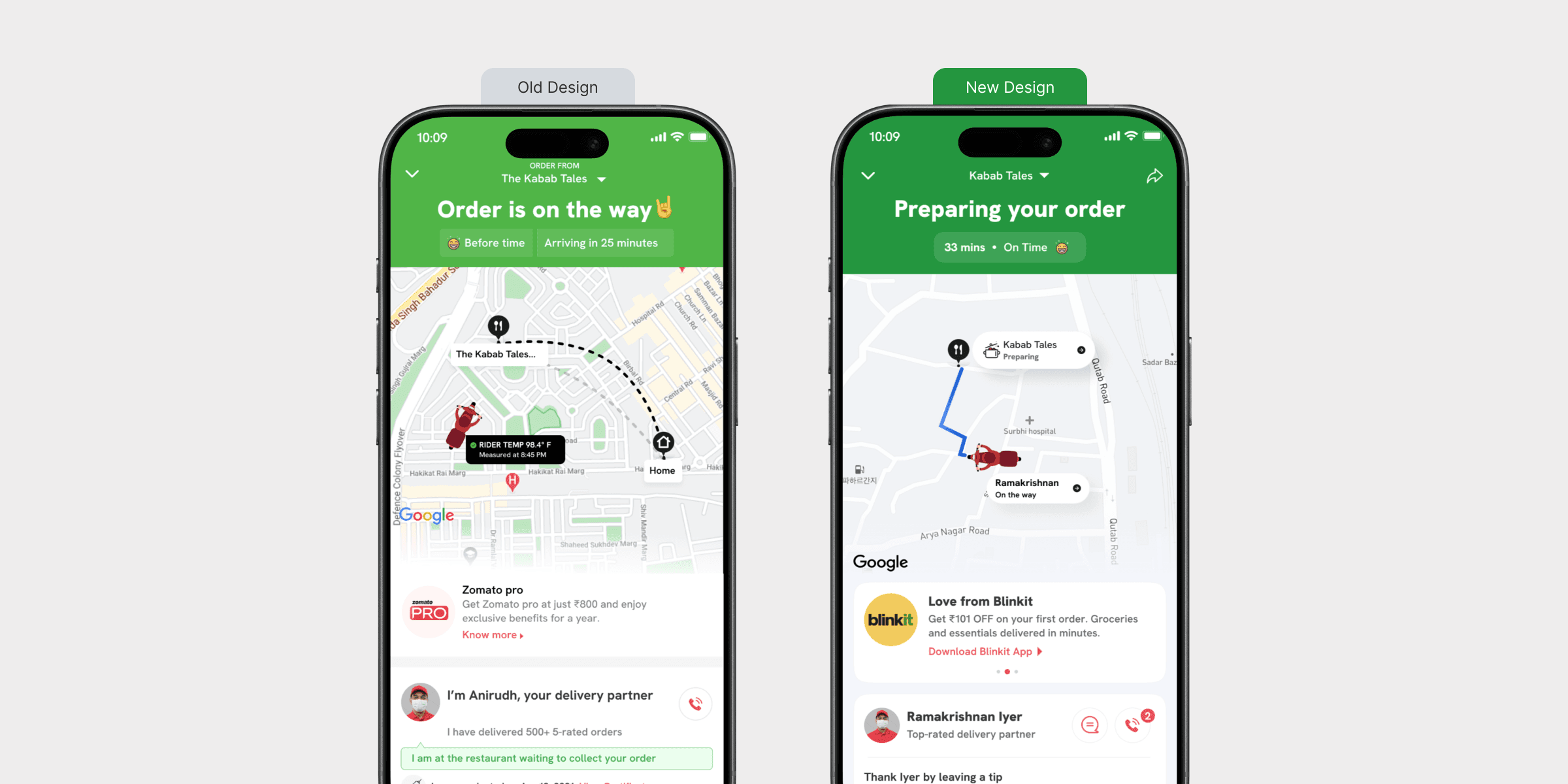
I know the entire order tracking process inside out - and plan to create a separate, dedicated case study for it.
Status headline updated — clearer, more accurate state language
Time display improved — '33 mins · On Time' — cleaner and more honest
Map component updated — cleaner delivery route with numbered restaurant marker
Delivery partner card redesigned with better visual clarity
Blinkit cross-sell card introduced in a non-intrusive format
Tip prompt added - 'Thank Iyer by leaving a tip' - friendly, human phrasing
PRIORITY 4 - MENU REDESIGN
Zomato's most complex screen
The Menu page carries the most information and has the highest interaction density. It's where most purchase decisions happen. This required the most iteration of any screen in V17.
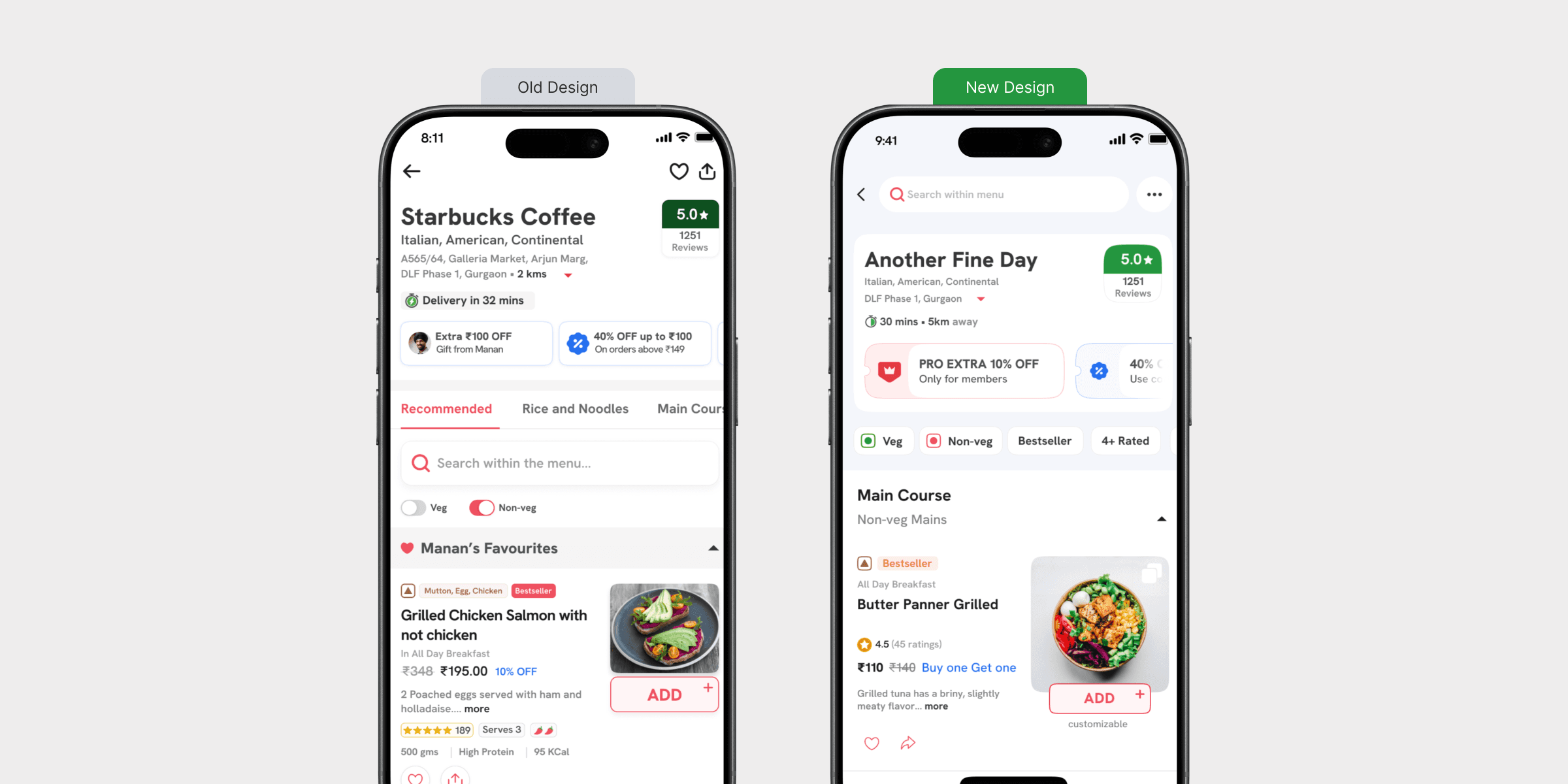
Restaurant header restructured - rating repositioned, delivery time and distance clearer
Pro Extra offer redesigned as a cleaner pill component - less noise
Veg/Non-veg toggles updated with clearer active state
Category tabs redesigned with stronger active state treatment
Menu item cards rebuilt - larger food images, cleaner price hierarchy, clearer ADD button
Bestseller and customisable labels made consistent across all card variants
Scrolled and collapsed sub-category states designed for long menus
PRIORITY 5 - SEARCH REDESIGN
Making search actually work for users
The old search had too much happening at once — food type pills, order-again suggestions, multi-dish prompts, and restaurant cards all competing without a clear hierarchy.
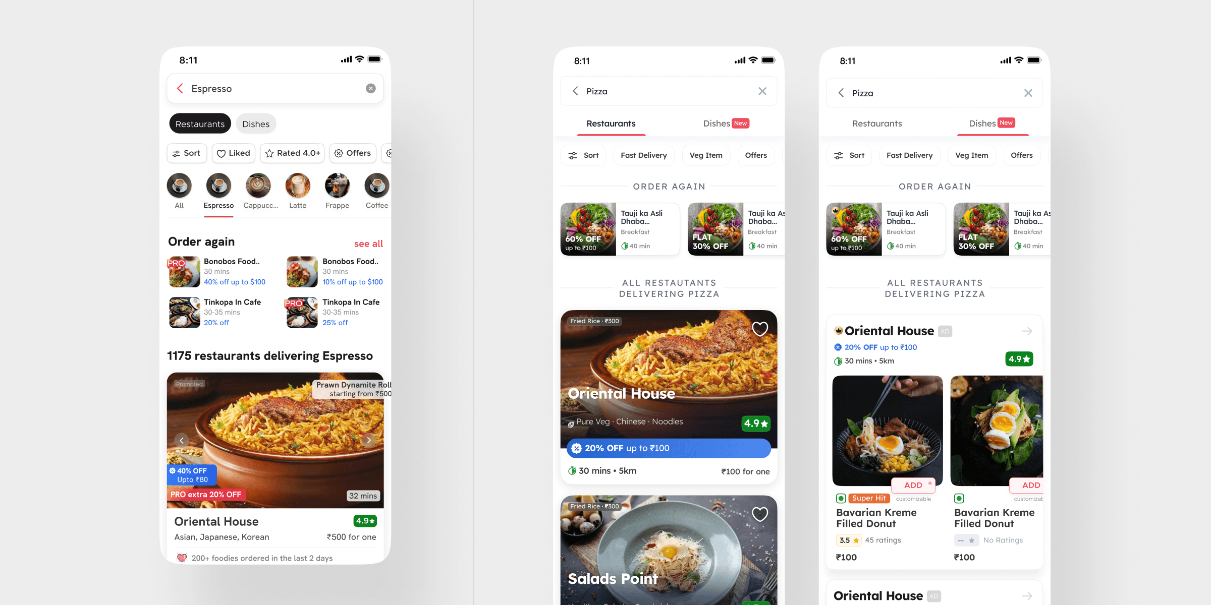
Restaurants / Dishes tab navigation introduced — clear content type separation
Filter chips placed as a consistent horizontal row — Sort, Fast Delivery, Veg Item, Offers
Order Again section surfaced prominently with horizontal scroll cards
Restaurant cards redesigned — larger imagery, cleaner rating and distance display
Dishes tab with 'New' label — surfaces dish-level search as a distinct feature
Keyboard state handled gracefully — results visible without content cutoff
CONCLUSION
Design thinking and user focus working together
The Zomato V17 revamp shows how design thinking and user focus can work together. We made the app more user-friendly and visually pleasing by improving screens, spacing, and organisation across every major flow.
OUTCOMES
What was delivered in V17 thinking and user focus working together
Redesigned 5 major app flows — Profile, Menu, Order Tracking, Cart, and Search — as part of the V17 consumer app update
Led the font migration from Okra to Ginger across the entire app — validated first on the busiest screen before
rolling out system-wideConducted a full app audit of V16, documenting and categorising issues across screens before any design work began
Established a prioritisation framework — starting with low-complexity UI screens and progressing to multi-task UX flows
Built and maintained the Sushi Design System — enabling consistent, scalable design across a large cross-functional team
Contributed to 30+ small and large projects across 2 years at Zomato — V17 being the most substantial among them